
year
2024
role
Web design
UX/UI Design
client
Billtrust
Improving Navigation Usability and Accessibility
Billtrust, founded in 2001, is a financial software company specializing in accounts receivable automation, digital payment processing, cash application, collections, and invoicing solutions for a diverse range of clients.
I was entrusted with leading the redesign of the website’s navigation to enhance intuitiveness, usability, and alignment with the new brand identity. Given that the new website was built on the Sitecore CMS, my designs had to seamlessly integrate within its framework. I was responsible for creating all navigation designs in Figma, defining the functionality of key features, and delivering comprehensive design specifications to the agency’s development team. This complex project required meticulous planning, stakeholder approvals, and thorough preparation of design assets to ensure a smooth transition from concept to implementation.
Challenge
A key challenge of this project was designing a more intuitive, ADA-compliant navigation system while working within the constraints of the Sitecore CMS. I was responsible for developing all designs to align with the existing brand identity, navigating the approval process, and presenting concepts to stakeholders. Additionally, I collaborated closely with agency developers to ensure seamless implementation. To validate the effectiveness of the new menu, I conducted usability testing and cross-browser testing, ensuring optimal performance and accessibility across all supported platforms.

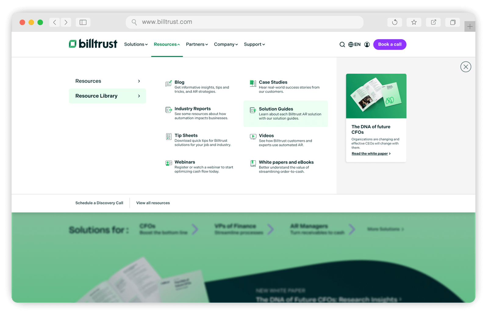
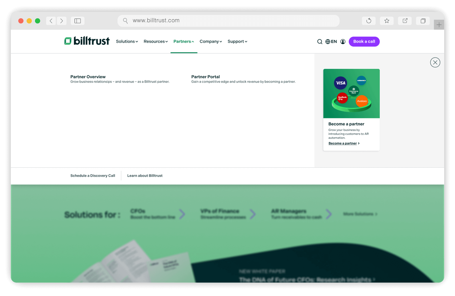
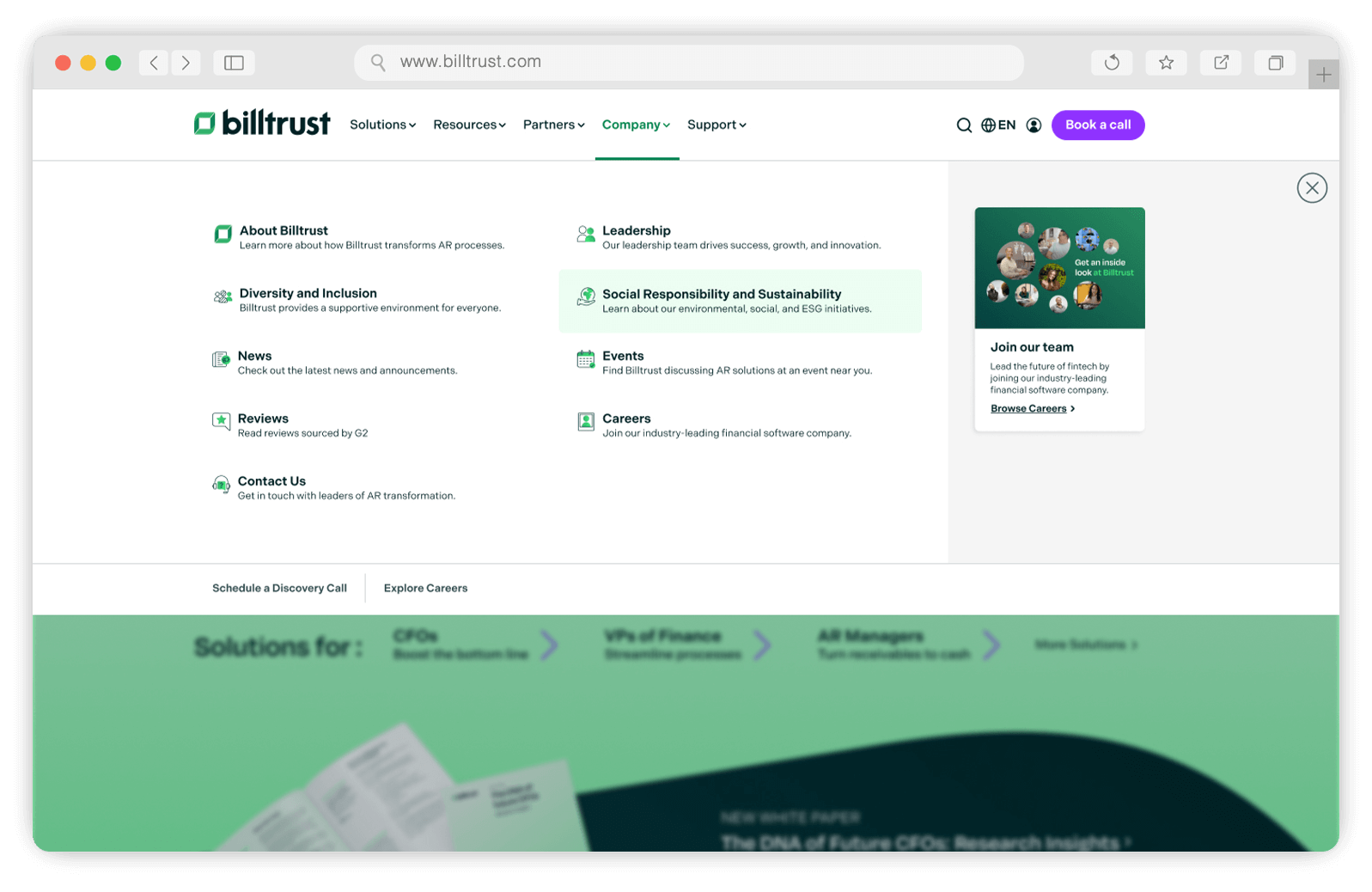
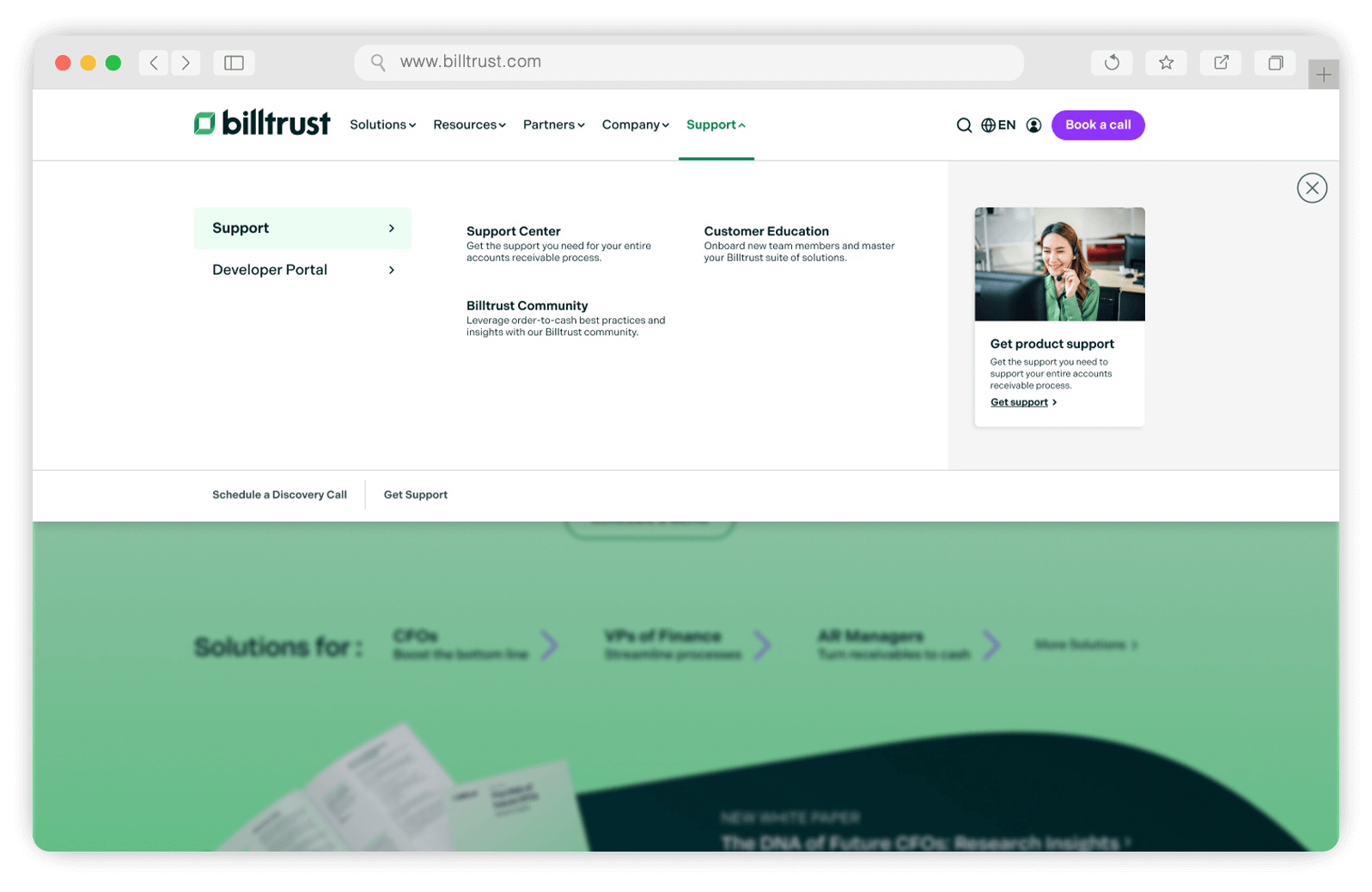
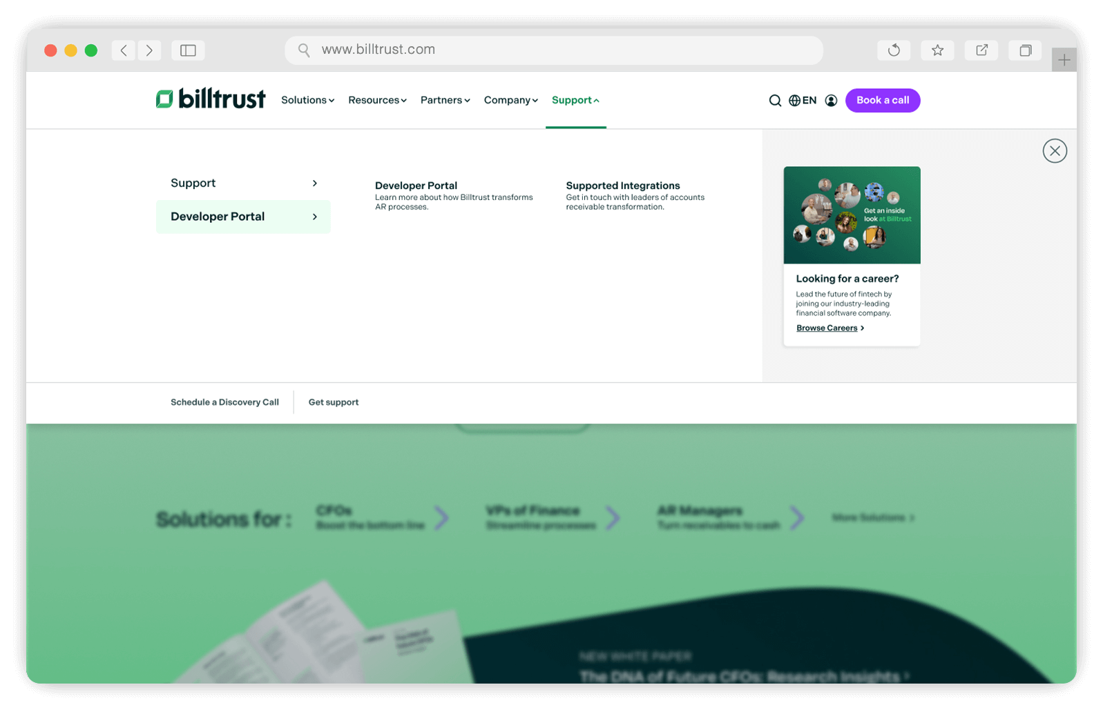
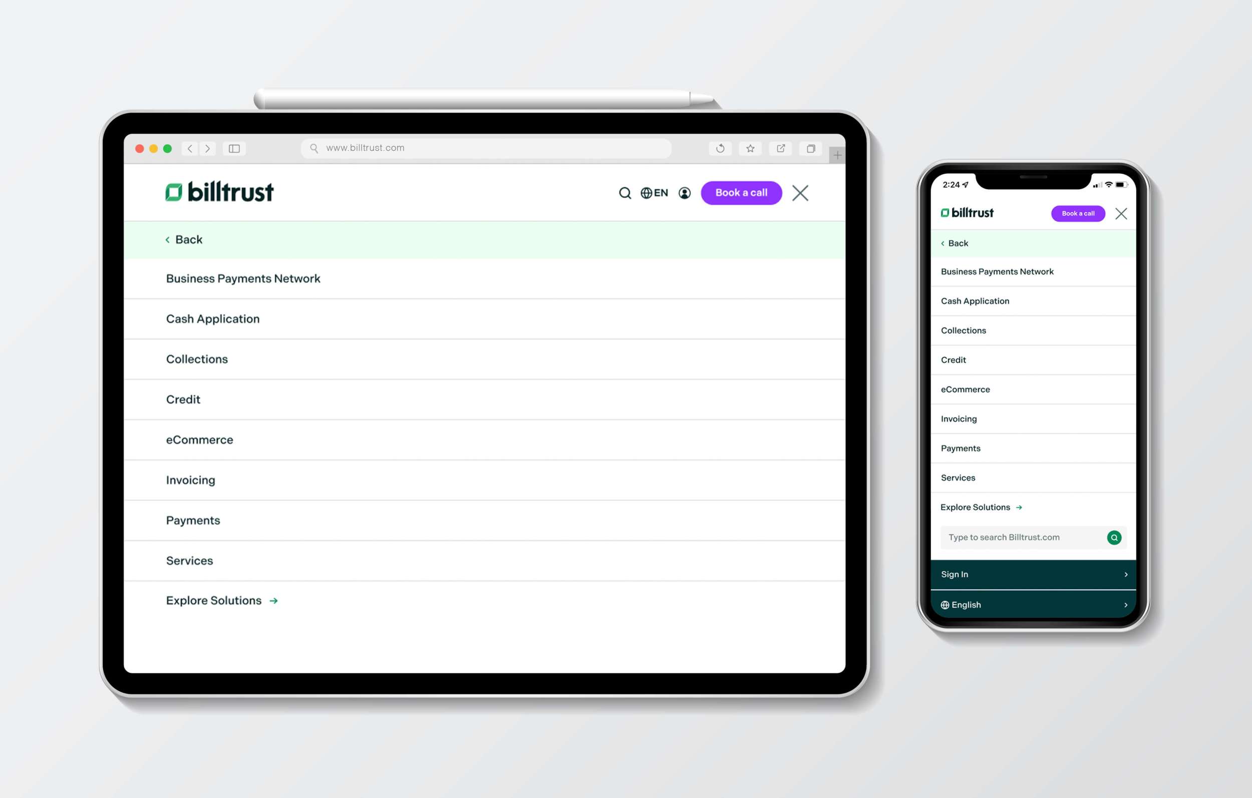
Mega Menu Designs
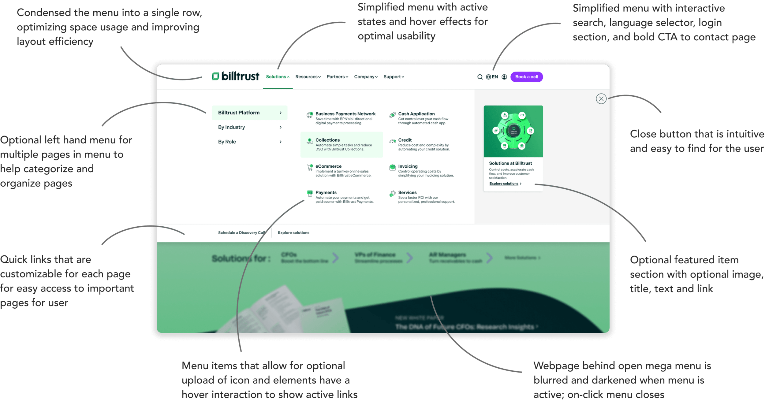
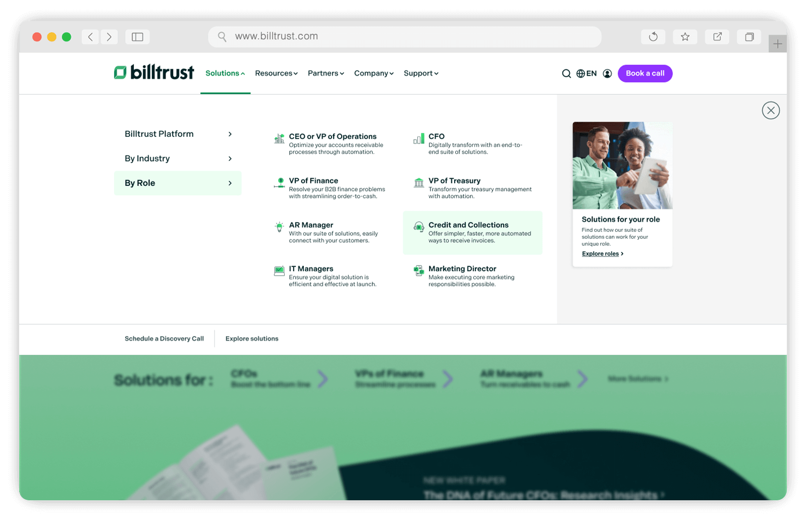
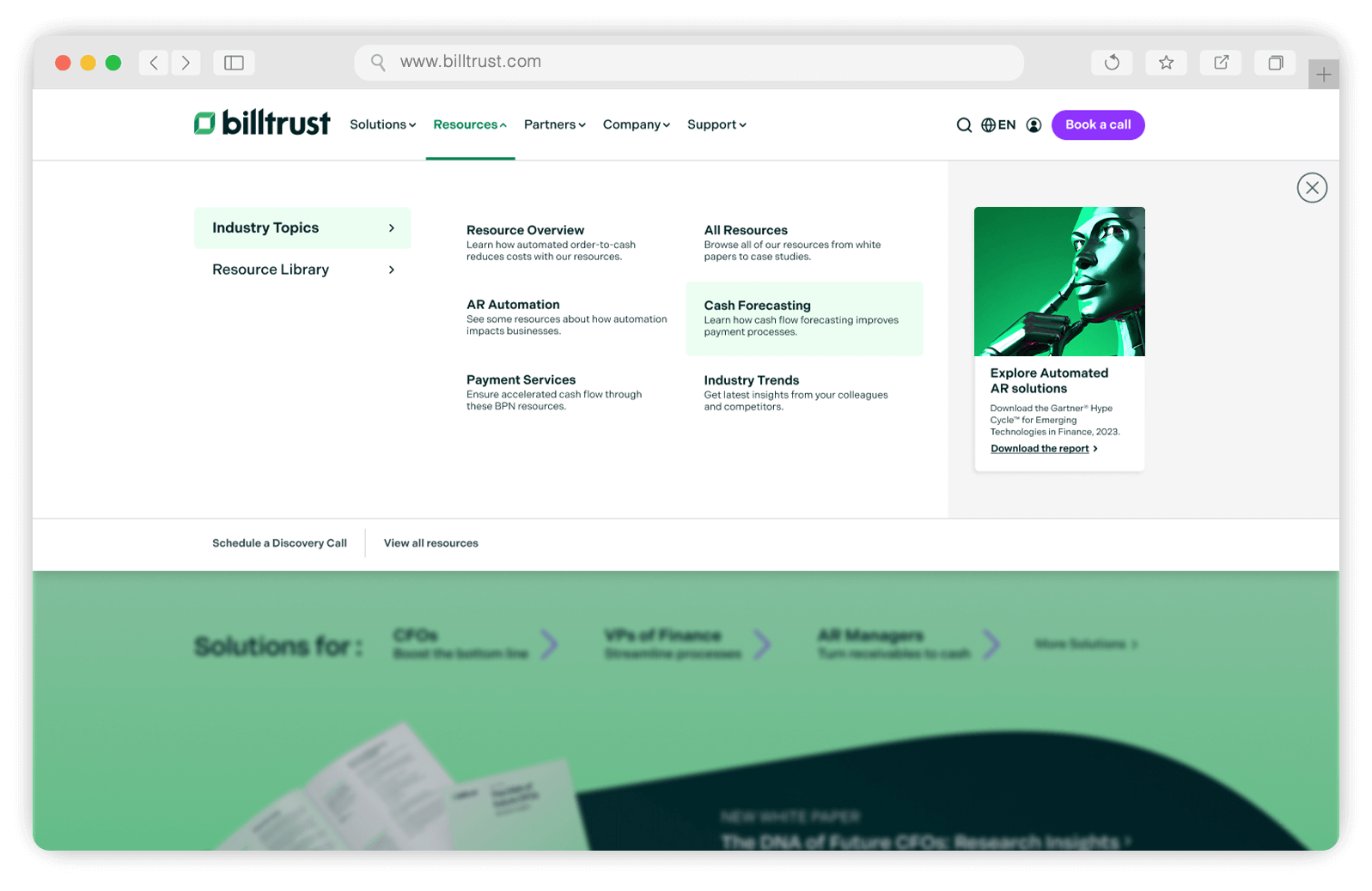
My approach to redesigning the menu focused on enhancing information architecture, usability, and accessibility while ensuring alignment with the new brand identity. The previous menu occupied excessive visual space with a two-row layout, so I developed a more streamlined design that provided a cleaner, more modern aesthetic. I strategically organized links to facilitate intuitive navigation, enabling users to reach their destinations quickly and efficiently while offering multiple pathways to key content. By prioritizing user-centric design principles, I aimed to create a seamless, visually appealing, and thoughtfully structured navigation experience.


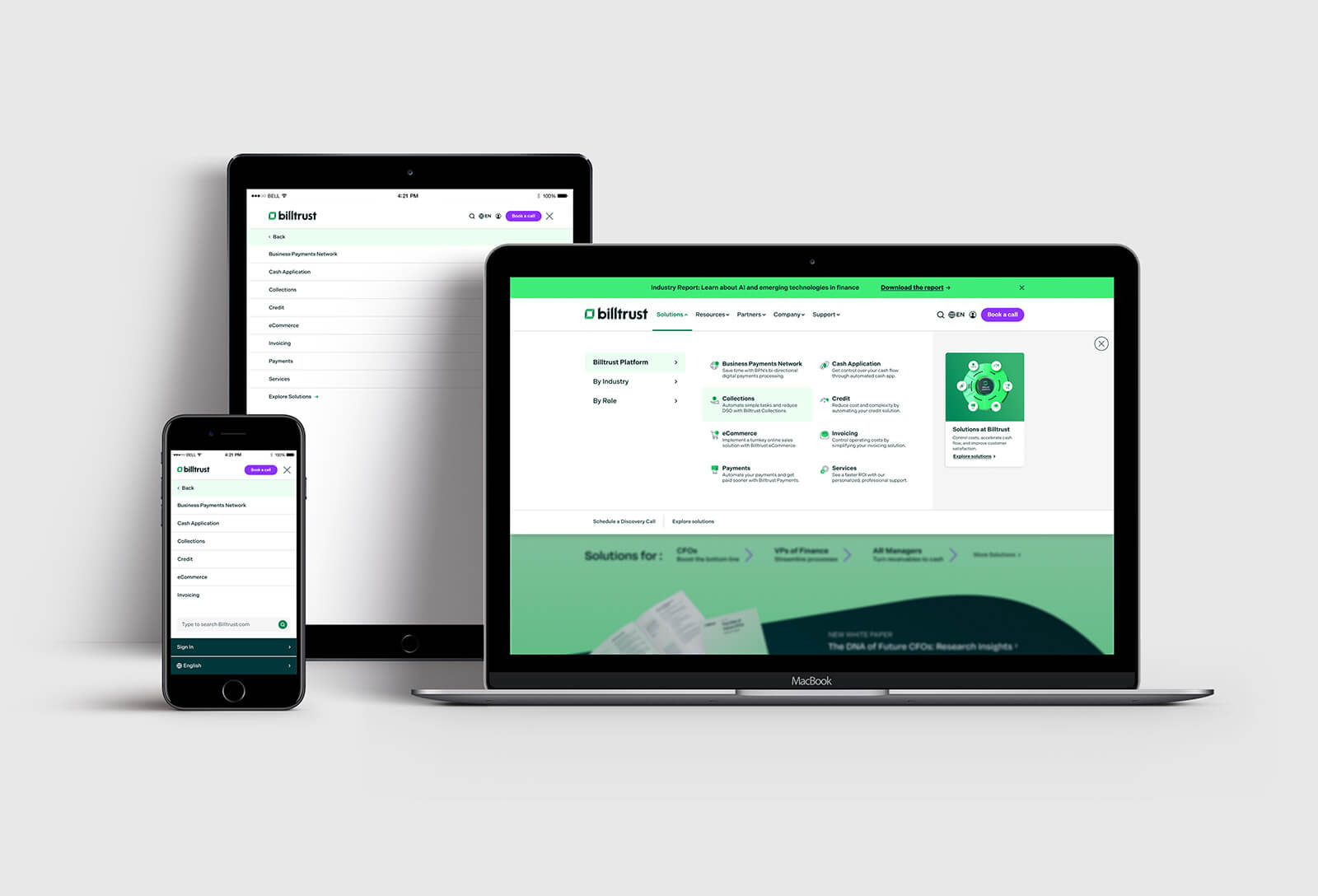
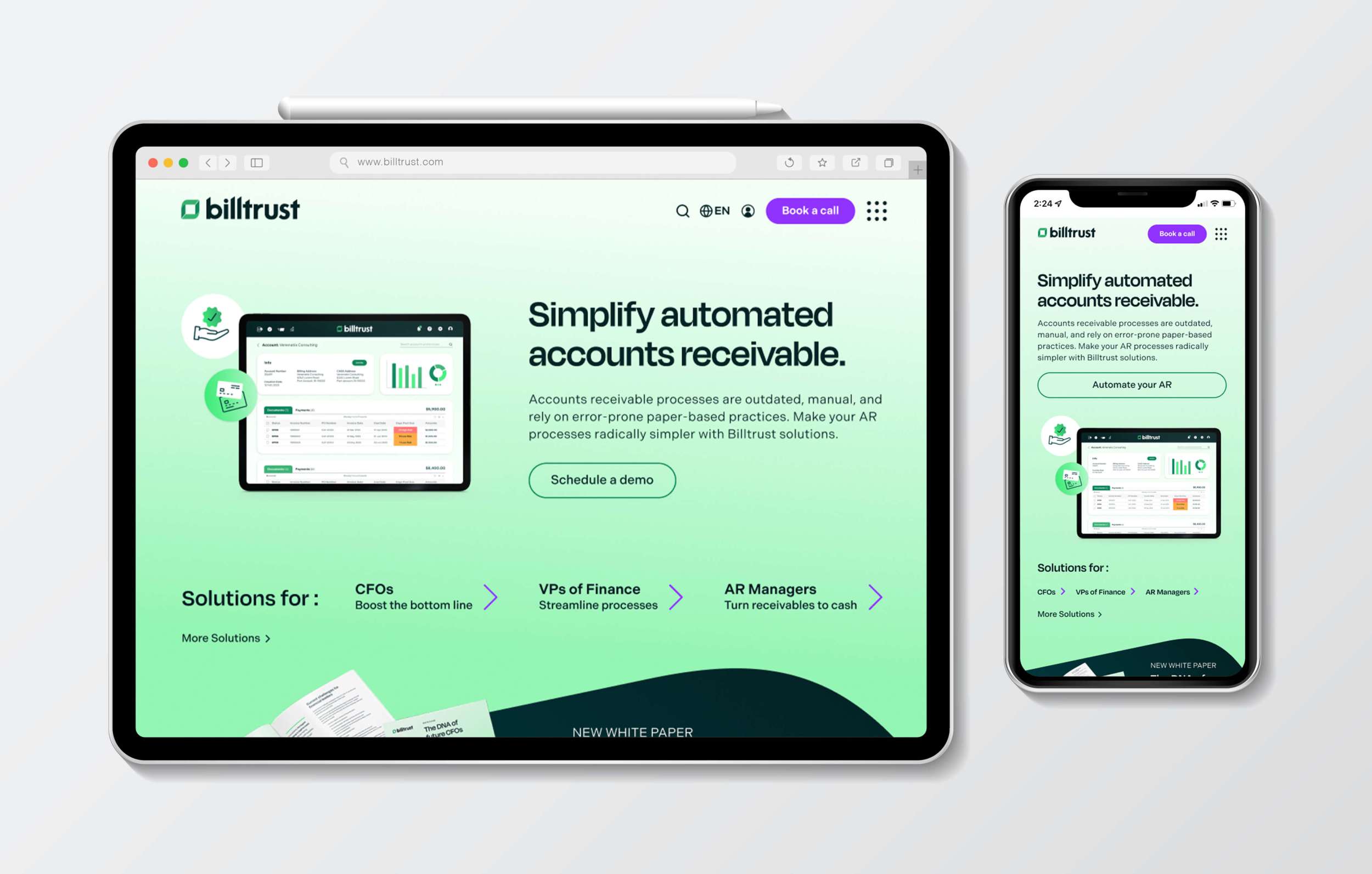
Responsive Designs
It was essential for the new designs to be fully responsive and compatible across multiple browsers and screen sizes. Throughout the design process, I prioritized solutions that ensured seamless functionality and an optimal user experience on tablets, mobile devices, and desktops alike.
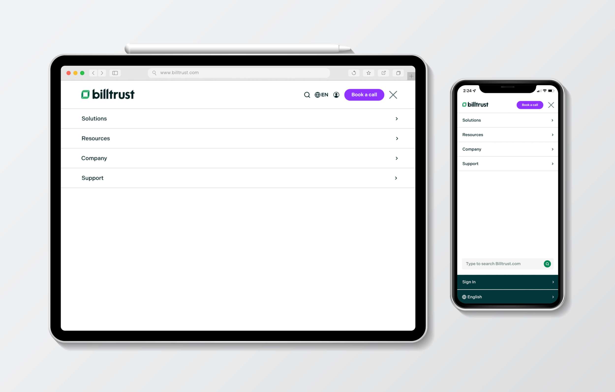
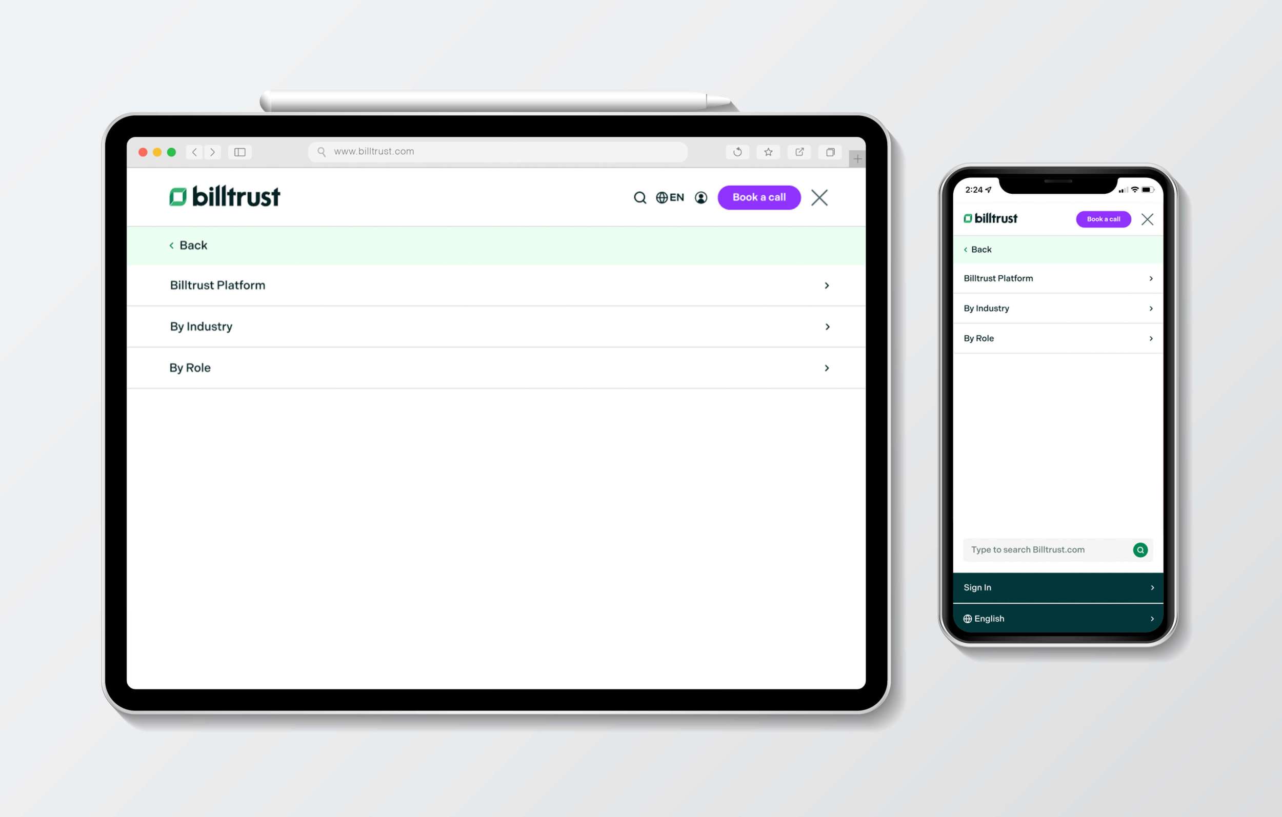
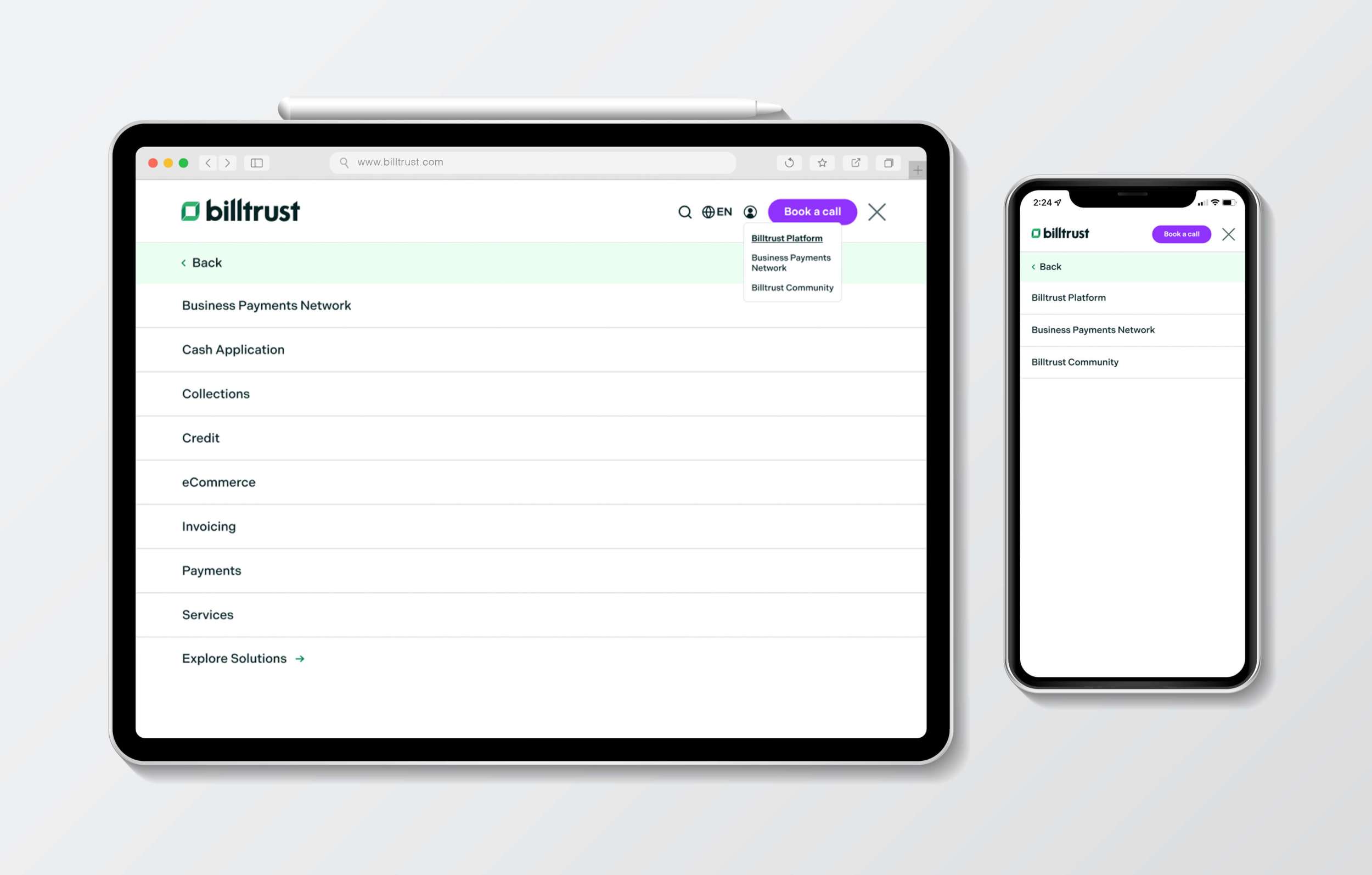
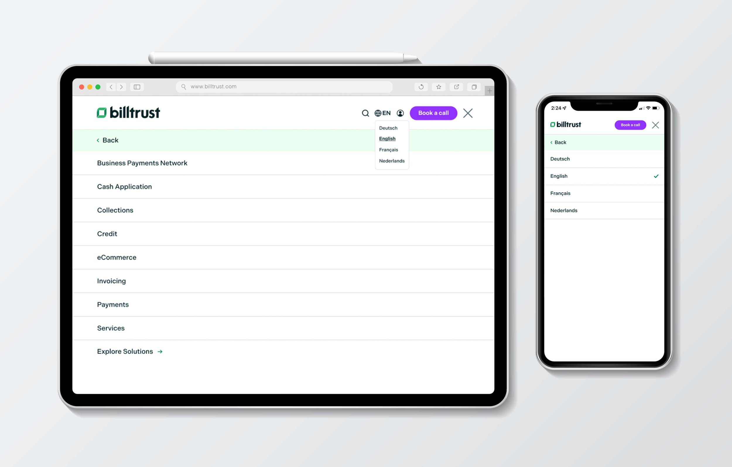
Click-through Experience
I aimed to incorporate moments of delight throughout the user’s interaction with the mega menu, enhancing both engagement and usability. Drawing inspiration from leading SaaS companies, I analyzed how their navigation systems functioned to inform my approach. It was equally important to maintain strong brand presence while achieving a clean, modern aesthetic. To ensure versatility and adaptability, I designed multiple variations of CTA buttons, notification bars, menu layouts, and menu items—ultimately crafting a custom, scalable menu system tailored to various user scenarios.
Overview
This project presented significant challenges due to the number of stakeholders involved in bringing the final product to fruition. The approval and development process required collaboration across multiple teams, including reviewers, approvers, developers, and creatives. Working with developers from an external agency was particularly valuable, as it provided insights into optimizing design handoff for seamless implementation. Following the launch, the impact of the redesigned mega menu was evident—user engagement increased, navigation became more intuitive, and users were able to reach their destinations more efficiently. Ultimately, the new menu better aligned with the company’s needs while enhancing the overall user experience.

